A fellow from an online writing group is brand new to publishing – a writer, he admits, not a publisher and not a marketer.
One of the things in which he expressed interest during the discussion was covers and cover art – so hence this post which shows how a book cover is born.
‘People eat with their eyes’, a used car sales man once told me. Rogue though he was, the man was right.
People are intrigued by what they first see, then they will open their hearts (and their wallets) to what is inside.
Whether you are looking at doing one yourself, hiring a graphic artist or are placed in the capable hands of a publisher’s in-house team – we writers owe three big cheers and an acknowledgement of our cover artists.
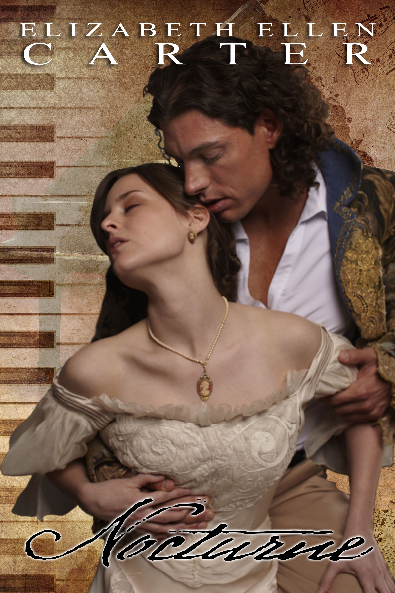
I’m using the cover of Nocturne, my upcoming novella (read more here – hint, hint) to reveal what goes on behind the scenes in making a beautiful romance cover (although the principles are just the same regardless of the genre).
A huge thank you my darling husband, Duncan from (Business Communications Management) for the such an outstanding cover!
Mood
The first step for the designer is to get the brief from the author. This should take the form of a questionnaire:
- How many main characters are there?
- What do they look like? Their age, gender, nationality, hair colour, eye colour, distinguishing marks
- What are their key attributes? Rock stars? Dukes and Duchesses? — You get the idea
- What is the style of the work? A sweeping romance? A gritty crime drama? A rom-com? An angsty YA coming-of-age? Dystopian?
You might also nominate covers of other titles that go some way to capturing the mood. This is invaluable to your cover artist – as are example of things you don’t like.
Before you shoot off all of that information, take a look at those other covers and ask:
- Why did they choose that image?
- Why did the artist use it in that way?
- Why was that typeface used?
Being able to articulate why makes briefing the designer so much easier. And helps you avoid ending up here…
Just an aside, being an author is means more than being a writer. If you are at all serious about making writing your profession, you should have an understanding of all of the elements that come together to bring your title to market.
That’s not to say that you have to be an expert in editing, photography, cover design, typesetting, formatting, audio-visual production (for book trailers), or marketing – you can hire experts to do one or more of those tasks – but you do need to understand the process.
The Book Cover
I had a clear vision in my mind on what the hero and heroine looked like. I visited a number of stock photography sites. If your publisher is supplying your cover, be sure you get the brief 100% spot on. Hopefully you will get the chance to approve the cover which plenty of time to make adjustments if things are egregiously bad (and sometimes you don’t… and that’s a story for another time.)
In my case I searched stock libraries that specialised in stock images for novels, particularly historical romance. I fell in love with the image of the hero and heroine and I knew I had found the major element of my cover art.
Buy the largest size image that you’ll need (you may wish to use it for a print edition or subsequent marketing material).
Once I had the image and verbally outlined my vision for the cover, Duncan went to work. I’m especially lucky because he and I are on the same wavelength 99% of the time. His first draft was 99.9% perfect from the get go.
DO NOT COUNT ON THIS FOR YOUR COVER DESIGNER – THEY ARE NOT MIND READERS AND THIS IS A COLLABORATIVE PROCESS
Now, where was I?
Ah yes.
In the case of Nocturne’s cover, it is made of three images plus type.
Let’s take a look at each layer:
The Regency-era hero and heroine were originally on a plain grey background. Perfect for deep etching (extracting the background). Duncan went to the extra work of keeping in Thomas Worsley’s curl of hair and the effort is worth it.
Our hero is a pianist, so he needs a piano. Duncan chose this piano because in Nocturne, the piano is in Blackheath Manor’s drawing room. You’ll also notice that it is ‘faded’. Duncan reduced its opacity so as not to compete with the real focus of the cover – Ella and Thomas. As you can see the image doesn’t go all the way to the bottom of our canvas, but that’s okay because he is going to introduce a new element.
This piece of stock art is perfect! The sepia tone suggests age, we have a piano keyboard and we have sheet music – all are elements in the story. It is also a very interesting texture, so this helps give us visual appeal. Let’s see how this is shaping up:
Ahhh, isn’t it lovely? But there are a couple of things missing. Can you guess what they are?
Whether the author name goes above or below the title is frequently less about pride and top billing (unlike film and TV) , and more about aesthetic design. There is a lot going on in the bottom part of the image. We have the hero and heroine in a close embrace, so the author name goes up the top in white to stand out.
We’re nearly there – we just need the title and even now we have to give it some serious thought.
Duncan went to the trouble of searching font libraries and font foundries (I love that name, it harks back to the early days of the moveable type printing press and the hot metal on which the lettering was cast). He chose one called 1805 Austerlitz:
In 1805, December second, the Napoleonic French army won the famous battle of Austerlitz, against Autrichian and Russian armies.
Napoleon was a great general, but his hand-writing was not legible at all, so he employed a few secretaries who wrote the official mail. This font was created, inspired from letters written by one of these professional secretaries and scribes in the months before the battle. We propose it as a typical example of the French Hand from this period.
The font contains numerous ligatures and alternative characters so as to look as close as possible to real handwriting.
Perfect! It’s just so evocative!
Our hero is wounded in the Battle of Quatre Bras, the final battle before Napoleon met his Waterloo. So just this one thoughtful choice in title font, tells the reader that they will be reading a story set in the the early 1800s.
Let’s look at the completed cover:
Isn’t it stunning?
I hope you’ve enjoyed this basic overview of cover design.
Now, with all of this new found knowledge, please give a hearty cheer once more to those amazing artists and designers who use their talent, experience and knowledge to make our books look wonderful.
And then with this new-found knowledge, you can take a look at some lousy book covers and know why they are so bad…


